Grade 5/6: What is Positive Space and What is Negative?
I was quite taken with some images I saw of this project, and so was looking forward to working on it with the class. I attempted to do so with a class that was a one-time visit, which I think was a mistake. In retrospect, this would have worked better with a class that I was more familiar with; one that would have patience with the process and even take their compositions further. The experience with this class was somewhat problematic. As visiting artist, I encountered a class that had some individuals who were very disruptive, and the class as a whole was rather poorly supervised by the teacher. This was eventually checked by the intervention of the principal, so those who were willing to engage in the project were finally free to do just that.
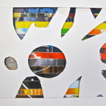
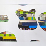
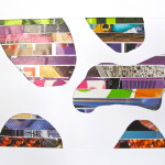
Sooo, I started by talking about positive and negative space: what are they, what are dome examples of, and I stressed the importance of having both in artistry, be it visual or vocal.
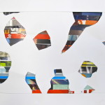
The process I put forward was this: 2 parts. The negative space would be made by taking narrow strips of magazines I pre-cut and glueing alongside each other, entirely covering a piece of 8 1/2 x 11″ paper. They could chose to gang like colours or to mix them up.
The second part of the process would be for the negative space. Each student was given a piece of white card stock. The idea now was to cut out various shapes across the whole (more than one) and lay this overtop of the colourful first part. This would have worked better if they could have used exacto knives to cut, but there was no way we could put knives in the hands of this class. I did, however, offer to do some cutting of the more difficult shapes with the knife I had on hand. For the most part they worked with scissors. I showed them my example, and encouraged them to think about the composition of those shapes, to push beyond just a couple of cursory cut-outs, and to think about the relationship between the shapes. What would make it an interesting arrangement?
Once the cut-outs were completed, it was time to attach the white card stock on top of the magazine strip page. To give it some depth, I made available some small pieces of foam I pre-cut from cleaned styrofoam trays, which they could attach to the back of the card stock. That was then applied onto the colour page, appearing to ‘float’ above it.
The results don’t go quite far enough. I would say the painstaking process of selecting and glueing down the magazine strips took too long for the desired effect, and they ran out of enthusiasm (as we were running out of time in the double period) when it came time to cut out the shapes in the card stock. Perhaps a quicker way of achieving the colour – say, painting the paper, or using oil pastel (you would want the results to be bold) – this would achieve the desired effect much better.
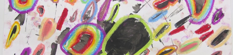
Will I try it again? Not sure. Do I like mine? Yeah, I still do.
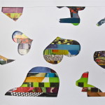
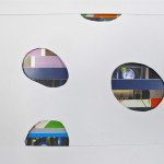
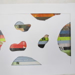
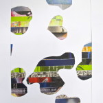
When you look at them, which is the positive and which is the negative space? Does that change from piece to piece?
Spring 2014 / Prince of Wales School
You must be logged in to post a comment.