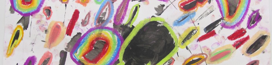
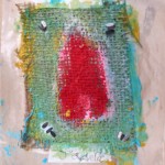
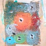
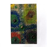
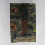
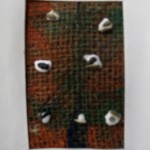
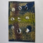
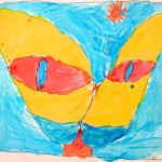
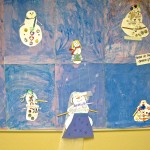
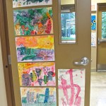
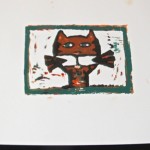
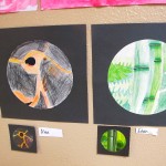
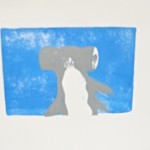
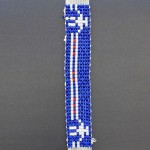
Grade 3: Painting Burlap Swatches for Garden Seeds
Why not plant some art in your garden?
Spring 2014 / Ferndale Elementary School
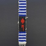
Grade 3: Painting Burlap Swatches for Garden Seeds
Why not plant some art in your garden?
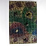
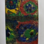

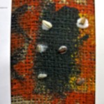
Spring 2014 / Ferndale Elementary School
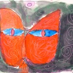
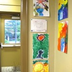
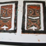
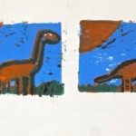
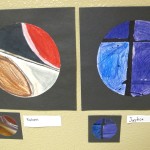
Grade 4/5: Chalk Pastel Cats & Dogs on Black
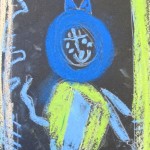
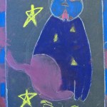
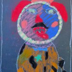
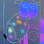
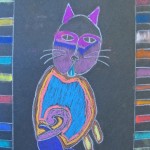
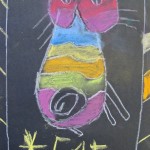
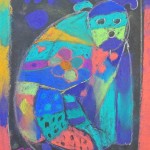
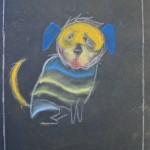
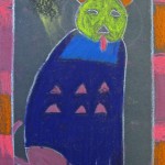
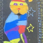
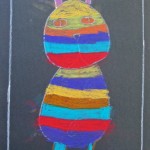
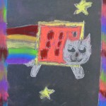
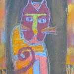
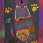
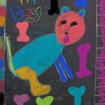
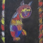
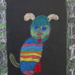
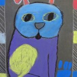
Spring 2014 / Prince of Wales Elementary School
Grade 4/5: Ink-Blown Trees 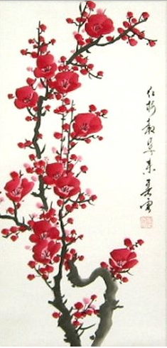
This is a fun one to do. Smocks on, pull out some straws (large diameter), velvety black india ink – and you’ve got a party!
Spring is barely here, and already the plum blossoms in Victoria have come and gone. (Or so I hear regularly, from my parents who are ever so glad to live there.) Here in Niagara, we have to make our own Plum Blossom Spring …
I showed them some examples of traditional Japanese Sumi-e ink paintings of plum trees in blossom, and of the signature chop that Japanese artists often use to sign their work. This project would give them an opportunity to do both, albeit using simpler methods.
We gave each student a long piece of white paper, with the short side nearest them. Using an eyedropper filled with good quality india ink, I dropped a puddle at the base of each page. Now, their job was to blow up and out, along the page, following the trails of ink to spread out in smaller and smaller branches, sometimes fanning out in surprising ways.
Pssst. If you are doing this with your class, MAKE SURE they take some breaks to just relax and breathe, or they will get dizzy. Don’t want any hyperventilating arteeeessts out there!
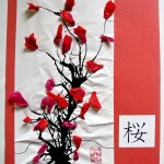
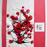
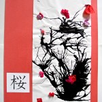
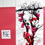
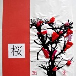
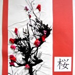
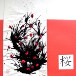
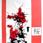
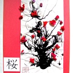
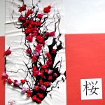
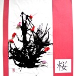
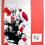
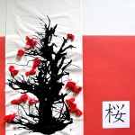
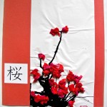
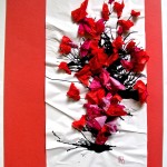
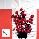
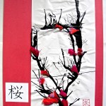
While the ink was drying (if needed, use a hair dryer to help with this), students collected the brilliant red, hot pink and pale pink tissue paper squares I had pre-cut (some 1″x1″, some 2″x2″). Cupping a few together (slightly askew) in 2 0r 3 layers, they glued each layer in the centre only, to make the plum blossoms. some would be larger for those closer to the viewer, and others smaller for the back of the tree. When they had assembled at least 20 flowers, and their ink tree was dry, then it was time to glue the flowers on. Hint: Remember to tell them to attach them to the branches, not free floating just anywhere.
Once again, I showed them some examples of chops (wood or clay block printed signatures), noting how they were oriented in a square or rectangle, perhaps with one character or letter in the upper part, and the second initial in the lower portion of the rectangle/square. Another reference for this might be some of the design work seen in the Arts and Crafts Movement of the early 20th century in England and the U.S.
On a scrap of paper, using a pencil, they now had to design their own chop – using their initials, or the initials of their nickname, for example. Once they had worked that into a pleasing ‘mini’ design, it was time to draw that on their plum blossom drawing, near the bottom, in red Sharpie marker.
Later, I mounted the artworks on large red construction paper, with the Japanese word for ‘peace’ as accompaniment. Don’t they look good?
Spring 2014 / Prince of Wales School
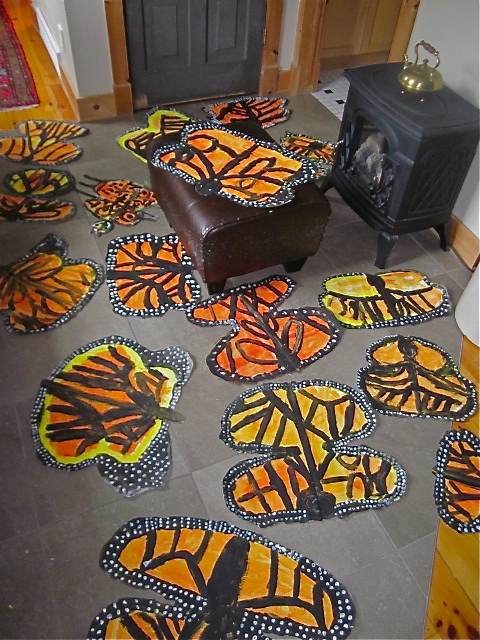
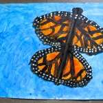
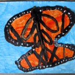
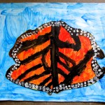
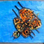
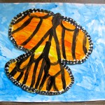
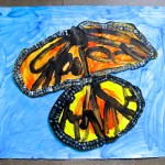
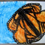
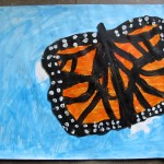
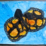
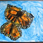
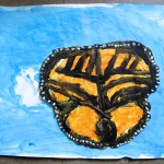
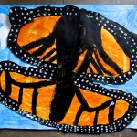
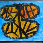
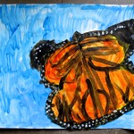
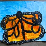
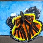
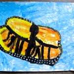
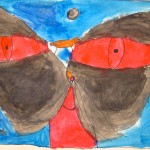
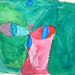
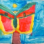
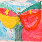
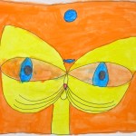
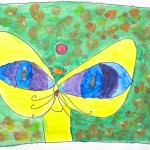
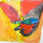
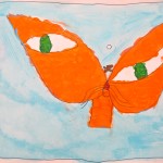
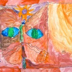
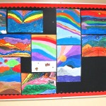
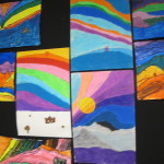
Grade 2/3: Painted Monarch Butterflies
Monarch butterflies are a familiar sight in these parts. Using various photographs of monarch butterflies, we talked about their migration patterns and then the parts of the butterflies themselves. I highlighted the details of the pattern found on the wings; shapes and colours. They’re so beautiful! What amazing creatures.
The Monarchs ‘migrating’ right through our house
Now, the main ideas of this particular Art Lesson: symmetry and mirror image. What are they? Could they see examples of mirror image and symmetry on the butterflies?
The Process:
1. Give each student a large sheet of thick white paper, folded in half cross-wise. Have them open the paper so it is like a large book in from of them. Each student then gets a large paintbrush, loaded with yellow paint. Have them paint a large “B” on the right hand side of the fold line. Large, I mean, fill that side of the page with the B. (Best to demonstrate right then) While the paint is still wet, close the right side over the B and press down all over to make an imprint. Open it up, and there you have the two wings: symmetry!
By the way, the kids’ desks were too small and too close for the open paper, so I had them working in two’s and threes on the floor.
2. Give each group a try of orange and yellow paint (No water – we want the paint thick). Get them to fill in the wings with the orangey yellow paint. Thick and luscious, please. This would be a good opportunity to let it dry even a little, if time allows – or if it is a single class.
3. Back into their groups – btw, it might be good for each group to have a photograph of a monarch butterfly to refer to. Each group gets a tray of black paint (no water), and every student a medium or large paintbrush. Review mirror image by demonstrating that one line or shape on one wing is immediately mirror imaged on the other. The wings are transected by black lines and the outer edges should be completely lined as well. Don’t forget to paint the body of the butterfly in black along the fold crease on the page – the head, the thorax, the abdomen, and even antennae, if they like.
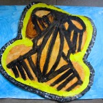
4. Now, they can allow a little time for the black paint to dry by turning their attention to the other part of the project. Set aside the butterflies, remove the black paint and blackened brushes, and give each student a new large sheet of white paper. More large brushes and brilliant blue paint: it’s time to paint the sky!
I demonstrated the way brush strokes can imitate the shapes of clouds, and that leaving some areas white MAKES clouds. Cover the whole page with your sky, please … yep, nice!
5. Put aside the blue skies and return to the butterflies. Using the other end of the blue brush, dip them into the small containers of white paint that have been just waiting to be used, and apply a series of dots only to the outer black stripe edging the wings. Encourage them to look again at the photographs of the Monarch butterflies, and notice where those small dots of white occur and where they do not.
That’s it for the day (day two?). The two pages need time to dry. Hopefully they put their names on the back of their pages even before they put paint to page. What remains is to put them together.
Day Two (or is it Three?):
Psst: Have small squares or strips of corrugated cardboard ready, enough for each student to evenly spread across their butterfly.
1. Cut out the butterflies (a demonstration on how to make rough cuts would be helpful here). Then, turn them over and glue on the corrugated cardboard bits evenly across the butterfly, using white drippy glue (yes, that’s the expression I use to differentiate from gluesticks). When those are all on, apply more drippy glue to each them, turn over the butterfly and have the students place them on their prepared sky page. Doesn’t have to be in the middle, and the butterfly can even extend a little off the page. It should look like it is just flying over the surface, and the picture just happened to catch a look at it in mid-flight. The result?
Show stoppers, every one. This project should be big and bold.
This is a good project to do when you have extra volunteers in the classroom. It does make for a lot of cleanup with any brushes in use and the various paint colours and trays. Just be warned – but it’s worth it!
Spring 2014 / Prince of Wales School
Grade 7/8: Free Form Sculptures Painted in the Style of …
Here’s a tease for what we’ve got going in the Art Room these days. Watch for more … coming soon!
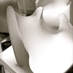
Okay, truth be told. I was leaving the Art Room the other day, turned out the lights, with one look back. There, in the shadows of the natural light coming in from the winter sun, sat this collection of nylon and wire sculptures. Primed white, still, – and beautiful! I put down all of my packages (I always have packages), and just had to snap a few pics. Gorgeous!
The next time you see them – NOT white.
Winter 2015 / Parliament Oak School
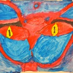
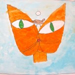
Grade 3/4: Drawing in the Style of an Artist
Generally, I do not insist on making students follow a rigidly directed way of drawing an image. In the case of this project, I did.
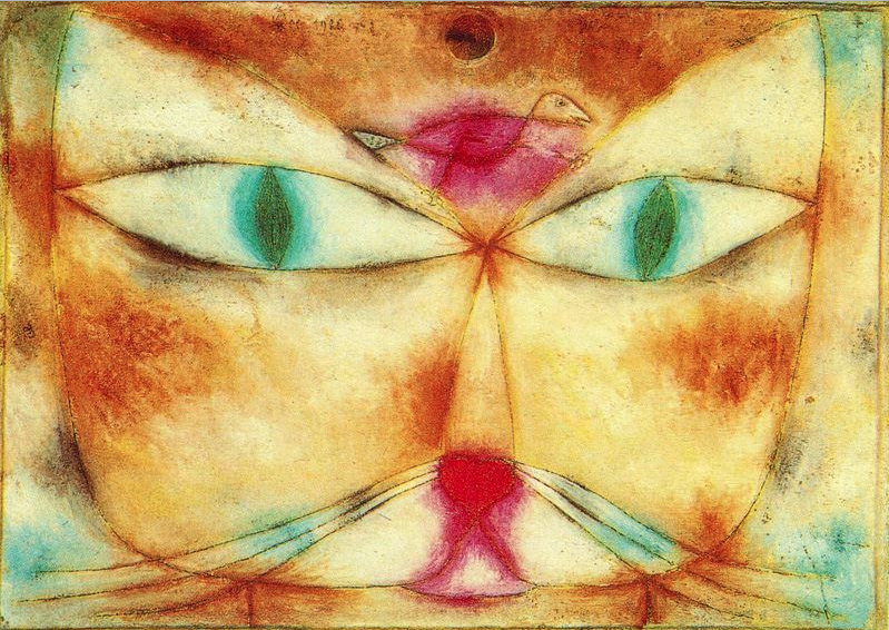
Paul Klee “Cat and Bird” 1928
To begin with, I introduced them to the work of Paul Klee, focusing on one painting: his 1928 “Cat and Bird”. I talked about how he saw the forms of such things as cats and birds as simple geometric shapes put together. What shapes could they see in the painting?
Time to get to drawing their own! I gave them big white sheets of paper, suggested they stand at their table to draw, and draw big! First, a pencil line frame around the edge. Then, as suggested by Anne Farrell on her blog, I walked them through drawing the cat (and bird), step by step. It was important for them to do it in the order I demonstrated, going along as I did on the white board. They needed to connect their work to Klee’s, and to learn an approach that might be different than their own. When they finished all of the drawing steps (don’t forget the bird … or the sun), they went over their pencil lines with black Sharpie marker.
Smocks on, paint out. It was less important for me to have them use colour in the same way Klee did, though they were quite free to follow his lead in that. Here is where their individuality blossomed – love that!
I think they were quite enjoying themselves; happy chatter as they painted, sometimes taking inspiration from one another. This took two double period classes to complete, with some early finishers doing a small extra project. Good reviews in the hallway once they were up!
Winter 2015 / Parliament Oak School
Big UP thanks to Anne Farrell at www.useyourcolouredpencils.blogspot.com for this lesson.
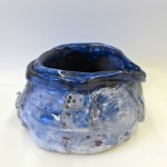
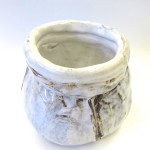
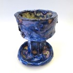
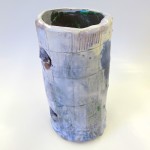
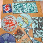
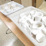
Grade 7/8: Slab and Coil-built Pottery
The year before, I had this class work on slab-built lidded boxes, using underglazes and clear or white glazes. Though my repertoire of cone six glazes had not improved, I felt it was time to be a bit more ambitious with the forms.
I showed some photographic examples of pottery through the ages and different cultures. The range can be quite staggering, so I distilled the project from there. I made 4 large line-drawings of pottery with their characteristic details that they could choose from, or they could peruse the photographs to find another that appealed to them. It was important to this project that they make a pot that drew from historic forms.
We reviewed some of the mechanics of working with clay (not too much water!), and of building forms using slabs, pinch pots, and/or coils.
Now, I have to say I had great hopes for this project, especially as I drew out the examples. There can be such beauty in these old pots! Unfortunately, one of the forms I did not draw but was observed in the photographs – was the beer stein. In fact, many of the boys (at the same table) decided to do this, in the most static and simple way possible. Not the embellishments of some of the finer German ones, but easy, straight-sided mugs rendered as quickly as possible. Sigh. I tried, but they were not interested in going any further. So I just tried to make sure they constructed them well and finished them cleanly. (again, with mixed success)
Other students took the opportunity to try building more ambitious pots, using forms and methods fairly new to them. All throughout, I tried to get them to refer to the historic, both in form and in decorative detail.
Underglazes and then glaze, and I fired them at home in my kiln. Here’s a few of the results!
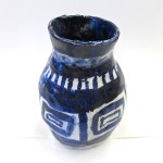
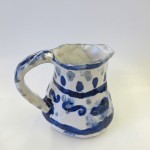
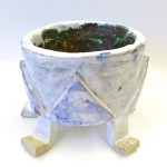
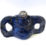
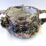
Spring 2014 /Parliament Oak School
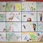
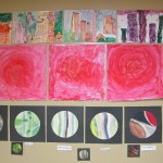
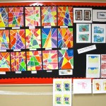
Parliament Oak Elementary Art Show / June 2014
It has taken a while for me to post, but here are some of the artworks we did last year. It’s a quick look:
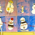
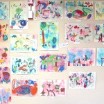
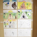

Drawing Ribbon Letters Decorated Snowmen
Collograph Prints Warm & Cool Cityscapes
Pastel Sunflowers (Vincent!) Ted Harrison Landscapes
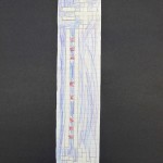
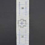
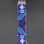
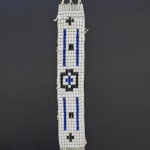
Wampum Belts 1 Point Perspective Roads
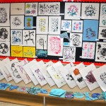
Valentine Tonal Hearts Linocut Prints
Various 3D Projects Miro Playgrounds
Circle Observation Drawings Geometric Winter Trees
Unfinished Glazed Pottery
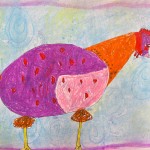
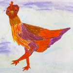
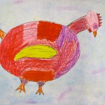
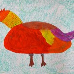
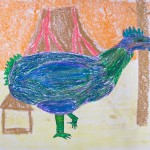
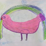
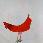
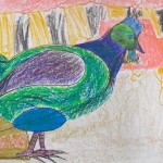
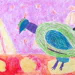
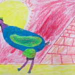
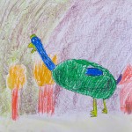
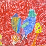
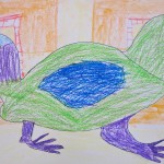
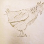
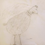
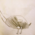
Grade 5/6: 2nd Chicken Drawing: This Time, with Colour!
Day 1.
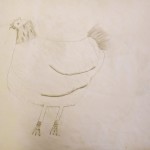
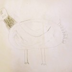
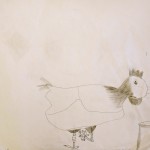
As outlined in the post ‘Chicken 1’, I gave the students an opportunity to draw a live chicken (appropriately named ‘Juinter’). After the more detailed and time consuming pencil sketch, they produced a faster line drawing using Sharpie markers directly on the page.
Day 2.
With Juinter happily at home among her sisters (who, by the way, did NOT allow her to let her head get too big with her sudden star status as a model), we carried on to add some colour to the line drawings.
This was a pastel day: we started with colouring the chicken only with oil pastels. As with when I taught this lesson years ago, I split the class into 2 halves. The group on the right (mostly boys, ’cause they like to sit together) were the cool (colours) group – and I showed them how to snap their fingers beatnik style. Cool, man.
The group on the left (mostly girls, ’cause they like to sit together) were the hot! (colours) group – they got the ‘ol “wet-your-finger-and-touch-it-to-your-butt-sizzle-style”. Tssss! I think they liked that. We had a couple rounds of both groups, just to get the motions and the sounds just right.
Okay, enough mucking’ around. I reviewed hot & cool colours, using the colour wheel. For sure, we were NOT trying to replicate Juinter’s actual colours. Instead, they could choose from among the luscious colours in their pastel boxes, in alignment with their group. This is when happy chatter happens, and kids settle in to life in the Art Room. Classical music on CBC Radio 2’s “Tempo” accompanies. (Thanks to Julie Nesrallah, the girl in the chair with the big hair).
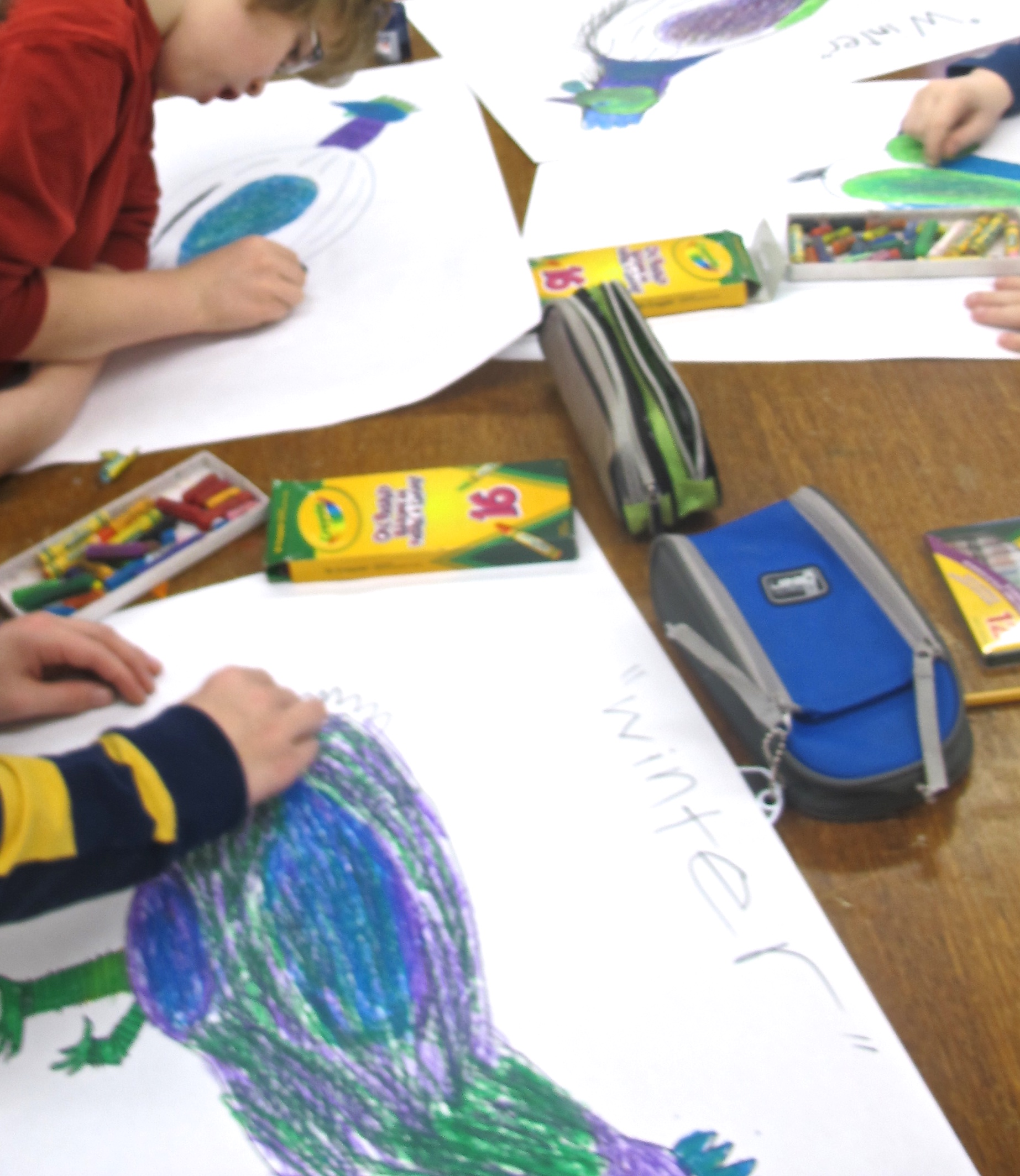
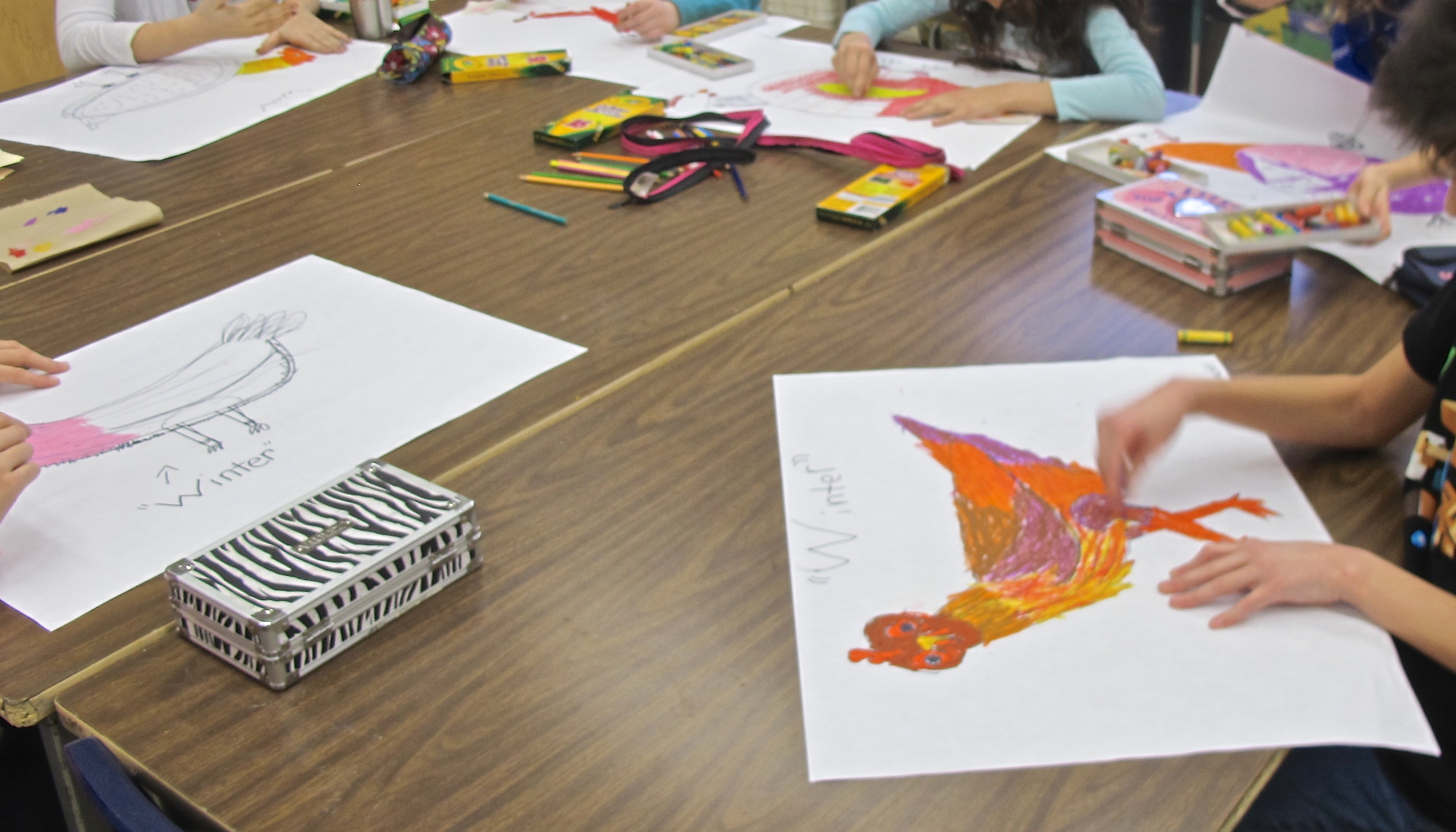
Once the chickens were coloured, it was time to switch it up. Oil pastels were exchanged for chalk pastels. The ‘hot’ group now became the ‘cool’, and visa versa. Time to fill in the background: I gave them the choice of doing it as a flat design or as a landscape or scene that the chicken could be standing in. If I do this lesson again, I would have some examples of fun and colourful designs to inspire the first group. The results could have been better and more carefully and imaginatively rendered.
Those who chose to do a scene (mostly the boys) had their imaginations in play, and you can see they definitely influenced each other. (did I mention they were sitting together?) No problem!
This is lesson I was happy to repeat, with the injection of colour – in the midst of a very snowy white winter – very welcome indeed. Cheers, grade 5/6’s!
Winter 2015 / Parliament Oak School
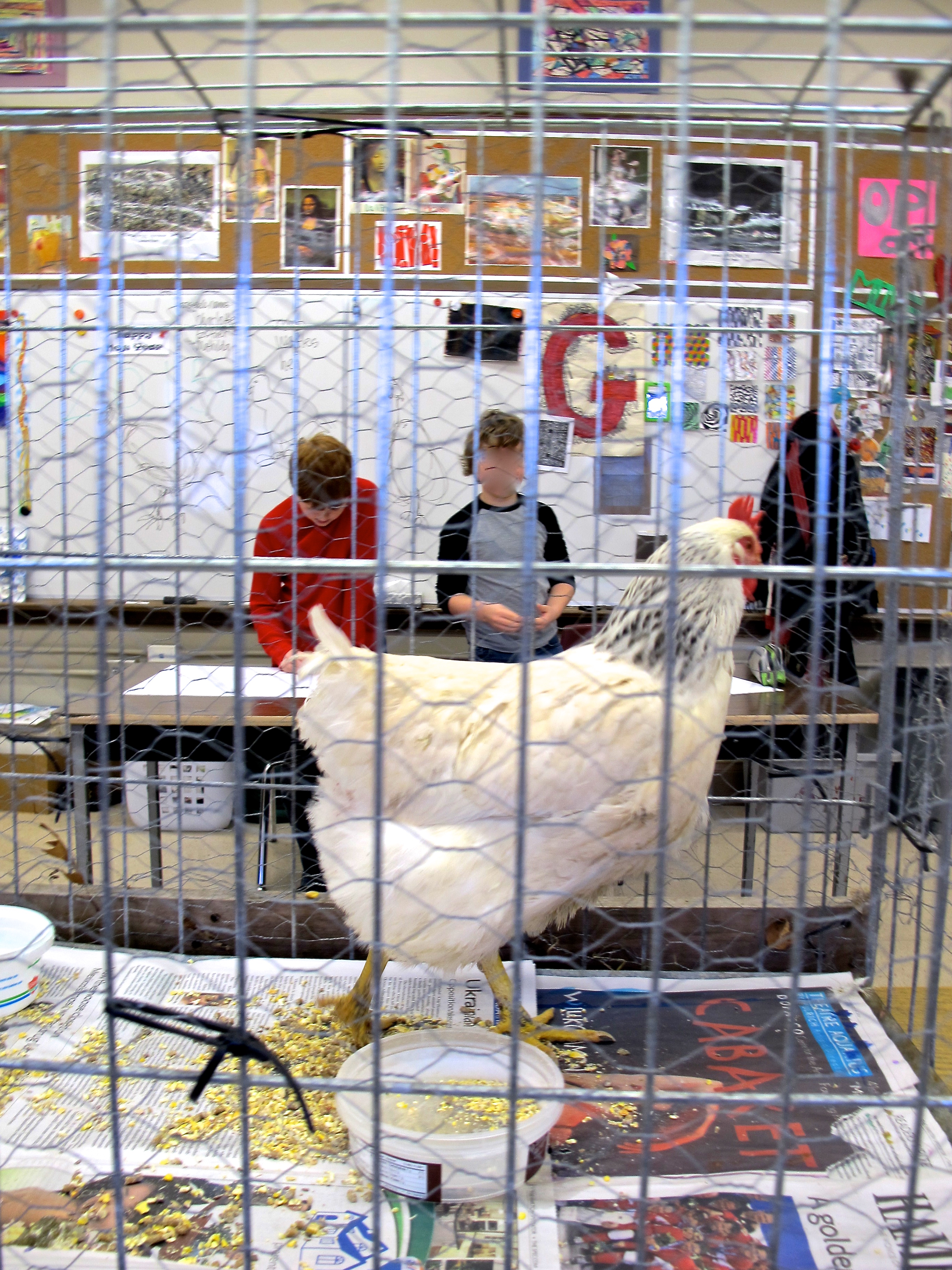
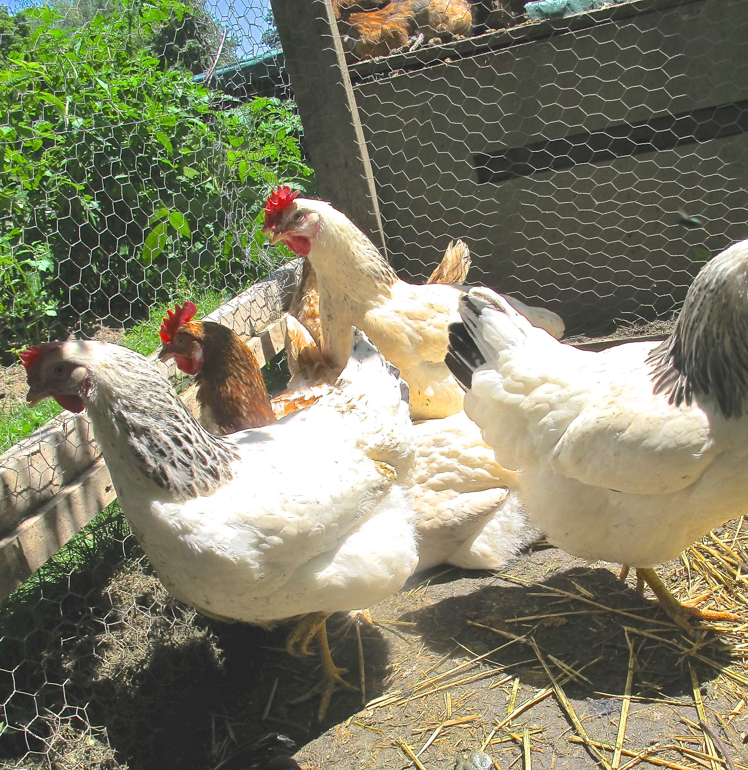
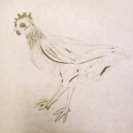
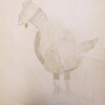
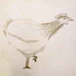
Grade 5/6: Observational Drawing a Live Subject
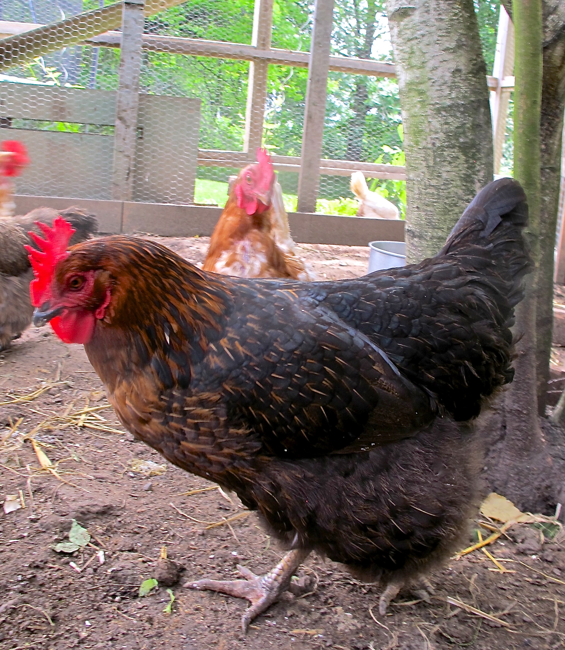
Juanita
Juinter
A few years ago I brought in one of our chickens for couple of my classes to draw. Having a live chicken in the school creates quite a buzz – I love those showy moments! The most showy chicken we had, and for all of her life, was Juanita. Named after a pretty girl in my son’s grade two class some years before; our Juanita was quite pretty, but (truth be told) a bit of a bully around her sisters. Smart, though – she was always one of the first to put herself right on the spot to get the worms when I was digging in the garden …
I planned to bring her in this year after the Christmas break for one more session in her dotage but – alas. She died (in my arms) just a few days before she was scheduled to appear. Sad to say goodbye to Juanita, the last of our first chickens.
So, it was time to appoint another diva. I selected one amongst our newest (a Columbian Rock x Red, for those of you in the know), packed her into the car, and – it was showtime once again. The kids were very happy and surprised to see a real chicken (in a cage, btw) when they walked into the Art Room that morning! They were hoping she would lay an egg during the class (she didn’t – divas do their own thing), BUT they did get to name her at the end of the time (after they got to know her a bit, of course).
The name “Winter” won the vote. Maybe had a bit to do with the time of year. After the class, as I was leaving (or should I say, heaving, that big cage), the school secretary (Debra) suggested “Winter” be spelled “Juinter”, since Juanita didn’t – um – quite make it. And so, a true chicken diva arises! Somewhat puffed up by her sudden debut, I do hope she does not make life hell for her industrious sisters back home … ha ha.
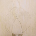
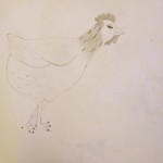
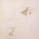
Now, to the actual session. I grouped the tables in a circle around Juinter, and talked about the basic geometric shapes that make up the form of the chicken: an oval for the body, a smaller one for the head, a wide cone for the neck. Details such as the swell of the wings and the chest, the shapes of the wattle and comb, the texture and pattern of the feathers, even the angle of the legs in relation to the body.
To help them start, I drew some examples on the board of how to start rendering the shapes. Details after that. Above all, I encouraged them NOT to draw just an anonymous cartoon chicken, but to observe all these things and try to incorporate their observations in their drawing.
The other aspect of this exercise is that the subject moves and that not everyone in the class is going to get a side view. I suggested that they choose a view, and would have to wait sometimes until that view showed up again as Juinter moved about. Not surprisingly at this age (and how many of you have ever drawn a live chicken anyway?), they all chose the side view. Sigh.
Oh well, no fluffy chicken butts for us that day.
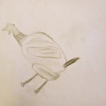
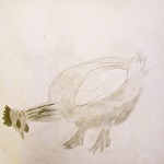
Two thirds of the class time was spent on these pencil drawings, as the teacher and I walked around, encouraging them and making suggestions, pointing out details. I gave some instruction on shading techniques, pointing out how lights and darks help to show the form, the 3 dimensionality, of the chicken’s body.
The remaining third of time was spent doing a second drawing. FASTER, a line drawing only, using Sharpie markers only. Forget the pencil, but still look to details and get the form down – now that they were more familiar with the subject. (still no egg)
This completed the day; you can see the results of the second drawings on the post Chicken 2.
Winter 2015 / Parliament Oak School
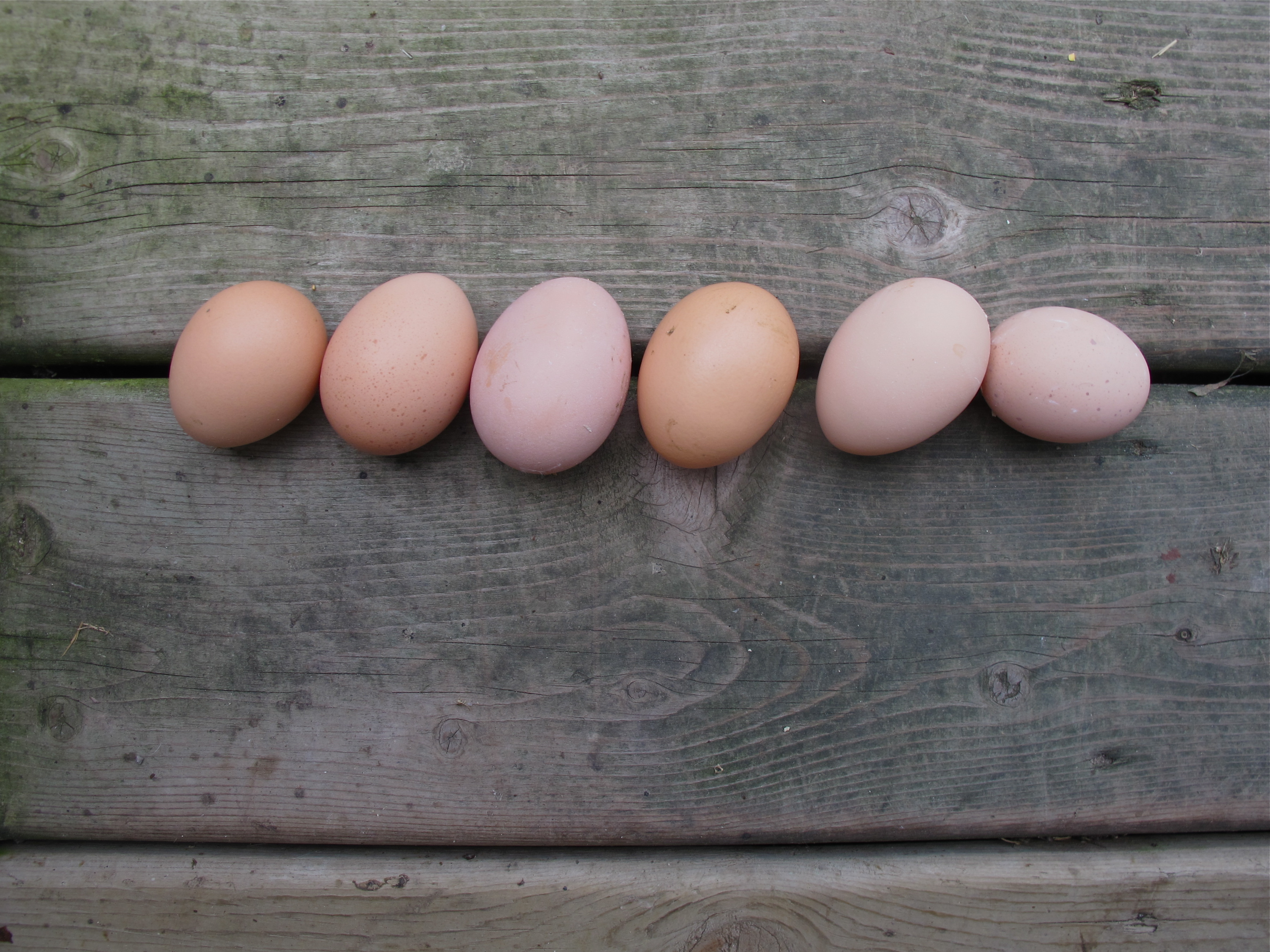 Just one more (or 6).
I can’t stop taking pictures of the eggs. So beautiful.